Your restaurant menu is the single most important page on your website. It’s where customers decide what to order — or whether to order at all. A cluttered, hard-to-navigate menu loses customers. A clean, well-organized one converts browsers into buyers.
In this guide, we’ll show you how to create a professional, mobile-optimized restaurant menu on WordPress using FoodMaster — with three different layout options, zero coding, and full color scheme customization. You’ll see real examples of each layout and learn which one works best for your type of restaurant.
What Makes a Great Restaurant Menu Page?
Before we get into the layouts, let’s establish what separates a great online menu from a bad one. After working with hundreds of restaurants, these are the patterns that consistently increase orders:
Clear Category Organization
Customers don’t read your menu top to bottom. They scan. They look for “Pizzas”, “Burgers”, “Drinks”, or “Desserts” and jump directly to what they want. Your menu must have clearly visible, well-named categories that let customers find what they’re craving in under 3 seconds.
No Page Reloads
Every time a customer clicks a menu item and gets sent to a new page, you risk losing them. Modern food ordering should happen on a single page — click an item, see its details in a popup, customize it, add to cart, and keep browsing. No interruptions.
Mobile-First Design
Over 70% of food orders happen on mobile devices. Your menu needs to work flawlessly on a phone screen — large touch targets, easy scrolling, readable text without zooming, and a visible cart button at all times.
Appetizing Visuals
Food photography sells. Menus with product images consistently outperform text-only menus. But the images need to load fast and be properly sized — not giant files that slow down your page.
Consistent Branding
Your menu should match your restaurant’s personality. A pizzeria should feel warm and energetic. A sushi bar should feel clean and minimal. A steakhouse should feel dark and premium. Colors, typography, and spacing all contribute to the mood.
The Traditional Approach (And Why It Fails)
Most restaurant owners try one of these approaches to build a menu page on WordPress:
- Upload a PDF — customers must download, pinch-to-zoom, and can’t order from it. Terrible on mobile.
- Use a page builder — drag columns and text blocks to manually build a menu layout. Looks decent initially, then becomes impossible to maintain when you change prices or add items.
- Install a “menu” plugin — most just display a static list of items with prices. No add-to-cart. No categories. No interactivity.
- Use plain WooCommerce — the default WooCommerce shop page is designed for physical products, not food. Grid of product cards with “Add to Cart” buttons that reload the page. It works, but it doesn’t feel like a food ordering experience.
None of these approaches give customers the experience they expect from a modern food ordering website. Here’s what works instead.
Three Professional Menu Layouts (No Coding)
FoodMaster includes three purpose-built menu layouts for restaurants. Each one is designed for a specific type of dining experience, and all three share the same benefits: AJAX add-to-cart modals, mobile optimization, automatic category organization, and full color scheme support.
Let’s walk through each one.
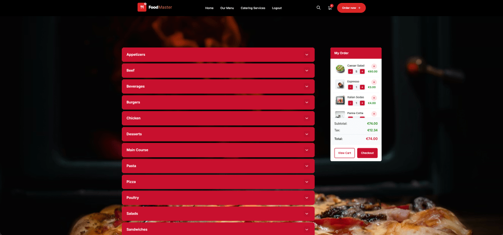
Layout 1: Accordion Menu
Best for: Restaurants with many categories — pizzerias, Italian restaurants, large multi-cuisine menus, and any restaurant with 8+ menu sections.
How It Works
The accordion layout displays your menu categories as expandable/collapsible panels. Each category starts as a header bar showing the category name. Click it, and the panel smoothly expands to reveal all the items in that category. Click it again (or click another category) to collapse it.
Why Restaurants Love It
- Handles large menus gracefully — a 50-item menu doesn’t feel overwhelming when customers only see one section at a time
- Fast scanning — customers see all category names at a glance and jump directly to what they want
- Minimal scrolling — collapsed sections take up very little vertical space
- Works perfectly on mobile — the collapse/expand pattern is intuitive for touch users
- Clean visual hierarchy — each category header uses your primary color, creating clear visual separation
What It Looks Like
Imagine your menu page with a clean stack of category bars:
- 🍕 Pizzas — tap to expand
- 🥗 Salads — tap to expand
- 🍝 Pasta — tap to expand
- 🍰 Desserts — tap to expand
- 🥤 Drinks — tap to expand
The customer taps “Pizzas” and sees all pizza items with images, descriptions, prices, and an “Add to Cart” button. They tap a pizza, a modal pops up with size options and toppings, they customize and add it — all without leaving the menu page.
Ideal Restaurant Types
- Pizzerias (pizzas, calzones, sides, drinks, desserts)
- Italian restaurants (antipasti, primi, secondi, dolci, vini)
- Chinese/Asian restaurants (soups, noodles, rice, seafood, poultry, beef, vegetarian)
- Any restaurant with 8+ categories
Layout 2: Side Menu
Best for: Restaurants that want a browsing experience similar to food delivery apps — category list on the left, products on the right.
How It Works
The side menu layout splits the page into two columns. The left column shows a fixed, vertical list of category names. The right column displays the products from the selected category. Click a category on the left, and the right column updates to show those items.
On mobile, the side navigation transforms into a horizontal scrollable bar at the top of the screen — similar to how UberEats and DoorDash display their category filters.
Why Restaurants Love It
- Category navigation is always visible — the left column stays fixed while customers scroll through products
- Familiar UX pattern — customers who’ve used delivery apps immediately understand how it works
- Great for visual menus — the wider product area gives more room for food photography
- Quick category switching — no need to scroll back to the top to change categories
- Professional appearance — the two-column layout feels polished and intentional
What It Looks Like
On desktop, picture a clean two-column layout:
Categories (fixed)
- Starters
- → Burgers (active)
- Sides
- Drinks
- Desserts
Products (scrollable)
Classic Burger — $12.00
Cheese Burger — $13.50
BBQ Bacon Burger — $15.00
Veggie Burger — $11.00
…
On mobile, the categories become a horizontal swipeable bar at the top, with products listed below. Tapping any item opens the quickview modal.
Ideal Restaurant Types
- Burger restaurants
- Fast food joints
- Cafes with food + drinks
- Any restaurant with 4–8 categories that benefits from visual product display
Layout 3: Sticky Tabs
Best for: Restaurants that want all menu items visible on a single scrolling page with smart navigation — sushi bars, tapas restaurants, bakeries, and menus where browsing is encouraged.
How It Works
The sticky tabs layout shows all your products on one long page, grouped by category. At the top, a horizontal row of category tabs stays fixed (“sticky”) as the customer scrolls. As you scroll past one category into the next, the active tab automatically updates to show which section you’re in. Tap any tab to instantly jump to that category.
Why Restaurants Love It
- Encourages discovery — customers naturally browse through all categories as they scroll
- Always know where you are — the active tab highlights which section is currently on screen
- Fast jumping — tap any tab to scroll instantly to that category
- Great for menus where everything looks good — customers see more items, which increases average order value
- Familiar pattern — many restaurant websites and apps use this navigation style
What It Looks Like
At the top of the page, a horizontal tab bar:
| Nigiri | Sashimi | Rolls | Tempura | Drinks | Desserts |
Below the tabs, all products are displayed in a continuous list grouped by category. As you scroll past “Rolls” into “Tempura”, the active tab smoothly shifts from “Rolls” to “Tempura”. The tab bar stays pinned to the top of the viewport the entire time.
Ideal Restaurant Types
- Sushi bars (nigiri, sashimi, rolls, special rolls)
- Tapas and small plates restaurants
- Bakeries and dessert shops
- Brunch spots with compact menus
- Any restaurant with 3–7 categories where browsing is part of the experience
Which Layout Should You Choose?
Here’s a quick decision guide:
| Your Situation | Recommended Layout | Why |
|---|---|---|
| Large menu (8+ categories, 30+ items) | Accordion | Keeps the page manageable by collapsing sections |
| Medium menu, want an app-like feel | Side Menu | Fixed category navigation feels familiar from delivery apps |
| Compact menu, want browsing | Sticky Tabs | Encourages customers to discover and scroll through everything |
| Pizzeria with many topping categories | Accordion | Each pizza category (Classic, Specialty, Calzones) collapses cleanly |
| Burger joint with few categories | Sticky Tabs or Side Menu | Simple navigation for a focused menu |
| Sushi bar with many small items | Sticky Tabs | Scrolling through rolls and pieces is natural |
| Multi-cuisine (Chinese, Indian, etc.) | Accordion | Handles 10+ categories without overwhelming the page |
| Coffee shop with food + drinks | Side Menu | Two main sections (Food | Drinks) with subcategories |
The good news: you can switch between layouts at any time from the FoodMaster settings. Your menu items, categories, and customizations stay exactly the same — only the presentation changes.
What All Three Layouts Share
Regardless of which layout you choose, every FoodMaster menu includes these features:
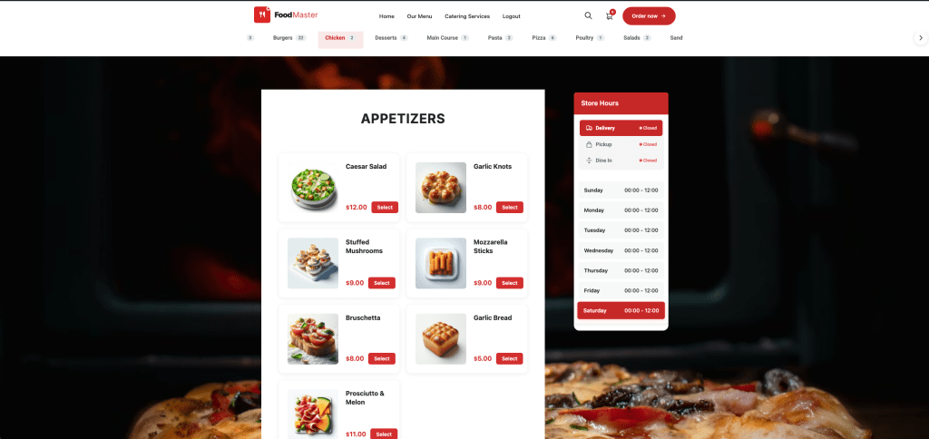
AJAX Quickview Modal
When a customer clicks any menu item, a modal popup opens showing the product image (served as an optimized square thumbnail), description, price, variation options (sizes, choices), extra options (toppings, add-ons), and quantity controls. They customize and add to cart without ever leaving the menu page.
Sticky Mini Cart
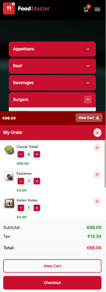
As customers add items, a mini cart appears on screen showing item count and running total. On mobile, the “View Cart” and “Checkout” buttons are always visible at the bottom of the screen — no scrolling required to find them.
Automatic Color Scheme
Your chosen color scheme is applied automatically to every element: category headers, buttons, active tabs, cart, prices, hover states, modal headers, and mobile controls. If you chose the “Pizzeria” color scheme, your accordion headers are red. If you chose “Seafood”, they’re blue. No CSS editing needed.
Mobile-Responsive by Default
All three layouts adapt to mobile screens using pure CSS — no JavaScript detection, no breakpoint hacks. Touch targets are minimum 48px, text is readable without zooming, and the layout reflows naturally for any screen size.
Product Images (Optional)
You can enable or disable product images per layout. Menus with images convert better, but text-only menus load faster and work well for restaurants with many items. FoodMaster automatically generates optimized square thumbnails for the quickview modal.
How to Set Up Your Menu (Step by Step)
Here’s the complete process from zero to a finished menu page:
Step 1: Create Your Categories
Go to Products → Categories in your WordPress dashboard. Create one category for each section of your menu. Keep names short and clear — “Pizzas” not “Our Delicious Pizza Selection”.
If you used FoodMaster’s demo import during the setup wizard, categories are already created for your restaurant type.
Tip: Use the “Order” field to control which categories appear first. Most restaurants put their signature items or highest-margin category at the top.
Step 2: Add Menu Items
Go to Products → Add New. For each menu item:
- Title — the item name (e.g., “Margherita Pizza”)
- Description — a short, appetizing description (e.g., “Fresh mozzarella, San Marzano tomatoes, and basil on our house-made dough”)
- Price — set in the Product Data section
- Category — assign to the correct menu section
- Image — upload a square photo (FoodMaster auto-generates the right sizes)
- Variations (optional) — for sizes, options (Small/Medium/Large, etc.)
Again, if you imported demo content, you’ll have menu items already populated — just edit the names, descriptions, and prices to match your actual menu.
Step 3: Add Extra Options (Toppings, Add-Ons)
For items that need customization, use FoodMaster’s extra options system. Create option groups like:
- Extra Toppings — Mushrooms (+$0.75), Pepperoni (+$1.00), Extra Cheese (+$1.50)
- Sides — French Fries (+$3.00), Coleslaw (+$2.00), Onion Rings (+$3.50)
- Sauce Choice — Ketchup, Mayo, BBQ, Garlic (free)
- Special Instructions — free text field for allergies or preferences
These appear inside the quickview modal when a customer clicks to add the item to their cart.
Step 4: Choose Your Layout
Go to the FoodMaster settings panel and select your preferred menu layout: Accordion, Side Menu, or Sticky Tabs. The change takes effect immediately on your menu page — no page builder needed, no shortcode editing.
Step 5: Preview and Adjust
Visit your menu page on both desktop and mobile. Check that:
- Categories appear in the right order
- Product images look appetizing
- The quickview modal opens smoothly when you click an item
- Extra options and variations work correctly
- The mini cart updates as you add items
- Colors match your brand
That’s it. Your menu is live.
Menu Design Tips That Increase Orders
Beyond choosing the right layout, here are proven strategies to increase your average order value:
1. Put Your Best Sellers First
Within each category, order items so your most popular (and highest-margin) items appear at the top. Customers tend to pick from the first few items they see. Use the drag-and-drop order in WooCommerce to control this.
2. Write Descriptions That Sell
Don’t just list ingredients. Create desire. Compare these:
- Bad: “Chicken, lettuce, tomato, mayo, bun”
- Good: “Crispy buttermilk chicken breast with fresh romaine, vine-ripened tomato, and house-made garlic aioli on a toasted brioche bun”
Descriptive language triggers cravings. Words like “crispy”, “house-made”, “slow-roasted”, “fresh”, and “hand-crafted” make a measurable difference.
3. Use Strategic Pricing
Don’t use dollar signs in your prices — research shows that “$12.00” feels more expensive than “12.00” or “12”. Place your mid-priced items next to the most expensive ones to make them feel like great value (this is called “price anchoring”).
4. Invest in Photography
One good photo per category is better than bad photos on every item. If you can’t photograph everything professionally, feature images on your signature items only and leave the rest as text.
For the photos you do use: natural lighting, overhead angle, colorful garnishes, and a clean background. Your phone camera is fine — lighting is what matters.
5. Limit Categories to 5–8
Too many categories create decision fatigue. If you have 12 categories, consider combining some. “Starters & Soups” instead of separate “Starters” and “Soups” sections. “Drinks” instead of “Soft Drinks”, “Juices”, “Hot Beverages”, and “Milkshakes” as four separate sections.
6. Add a “Popular” or “Chef’s Picks” Category
Create a category at the top of your menu called “Most Popular” or “Chef’s Picks” and add your top 4–6 items. Customers who don’t know what to order will default to these, and they tend to be your highest-margin items.
Frequently Asked Questions
Can I switch layouts after I’ve set up my menu?
Yes, at any time. Your menu items, categories, images, and extra options stay exactly the same. Changing the layout only changes how they’re displayed. You can test all three and see which one your customers prefer.
Do I need to write any CSS?
No. The color scheme you selected during setup (or changed later in settings) automatically styles everything: category headers, buttons, active states, hover effects, the quickview modal, the cart, and the checkout. If you want to fine-tune a specific color, you can do that from the settings panel — still no code.
How many menu items can I have?
There’s no limit. FoodMaster uses WooCommerce products, so you can have as many items as WooCommerce supports (which is effectively unlimited). The accordion layout handles large menus especially well since categories collapse.
Can I have a menu without images?
Yes. If a product doesn’t have an image, FoodMaster displays it cleanly as a text item with name, description, and price. You can mix items with and without images in the same category.
Do the layouts work with all color schemes?
Yes. All 23+ restaurant-type color schemes and 6 generic color palettes work with all three layouts. The colors are applied via CSS variables, so everything — from accordion headers to sticky tab indicators to side menu active states — matches your brand automatically.
How does it look on tablets?
All layouts are responsive across desktop, tablet, and mobile. The side menu layout shows the two-column view on tablets in landscape mode and switches to the mobile horizontal tabs in portrait mode. The accordion and sticky tabs layouts adapt their spacing and sizing for tablet screens.
Before and After: The Difference a Proper Menu Makes
Here’s what changes when you switch from a generic WooCommerce product grid to a FoodMaster menu layout:
| Before (Default WooCommerce) | After (FoodMaster Menu) | |
|---|---|---|
| Layout | Generic product grid | Purpose-built food menu |
| Add to Cart | Page reload | AJAX modal popup (no reload) |
| Customization | Separate product page | Inline in modal (toppings, sizes) |
| Category Navigation | Sidebar widget or separate pages | Built into layout (accordion/tabs/side nav) |
| Mobile Cart | Navigate to cart page | Sticky mini cart, always visible |
| Color Consistency | Default WooCommerce gray | Full branded color scheme |
| Loading Speed | Full page reloads per action | AJAX — single page, instant updates |
| Customer Feel | “This is an online store” | “This is a food ordering app” |
The difference isn’t just cosmetic. Restaurants that switch from a standard WooCommerce layout to a dedicated menu layout consistently report higher completion rates, larger average orders (thanks to visible extra options and easier browsing), and fewer abandoned carts.
Get Started in 10 Minutes
Creating a beautiful restaurant menu on WordPress doesn’t require a designer, a developer, or a page builder. With FoodMaster’s three built-in layouts, automatic color schemes, and AJAX-powered ordering experience, you can go from a blank page to a professional menu that converts — in the time it takes to brew a pot of coffee.
- Install FoodMaster and run the Setup Wizard
- Choose your restaurant type (color scheme applied automatically)
- Import demo content or create your menu items
- Select your layout (Accordion, Side Menu, or Sticky Tabs)
- Preview on mobile, adjust, and go live
New to FoodMaster? Read our complete guide to creating a food ordering website with WordPress for the full setup walkthrough.