On this page
- Prepare categories and products for tab mapping
- Create menu categories that work as tabs
- Assign each food item to the right category
- Find the category slugs or IDs you may need
- Build the tabbed menu page in WooCommerce
- Create the menu page and add the tab container
- Add category-based product lists inside each tab
- Check tab order and menu flow before publishing
- Set mobile behavior and basic styling
- Make tabs easier to use on phones
- Style active tabs and content areas
- Compare layout options before finalizing the design
- Conclusion: Publish, test, and refine the tabbed menu
- Final checks before going live
- FAQs
- How many tabs should I use?
- Should I use tabs or an accordion?
- Why is my cart resetting between tabs?
- Related Blog Posts
If you want people to order with fewer clicks, put your WooCommerce menu on one page with category tabs. I’d set up 5–7 tabs, link each tab to one product category, use category slugs or IDs where needed, and test the page on 375 px and 414 px mobile screens before publishing.
Here’s the short version:
- I’d use one tab per category like Burgers, Pizza, Desserts, and Drinks
- I’d keep all products on a single menu page so people don’t bounce between pages
- I’d show each item with an image, title, price in USD, and Add to Cart
- I’d use a Tabs block, page builder, or restaurant ordering plugin like
[product_category] - I’d keep mobile tap targets at 44×44 px with about 8 px between tabs
- I’d switch to an accordion if the menu has 8+ categories
- I’d test cart behavior so switching tabs does not reset the order
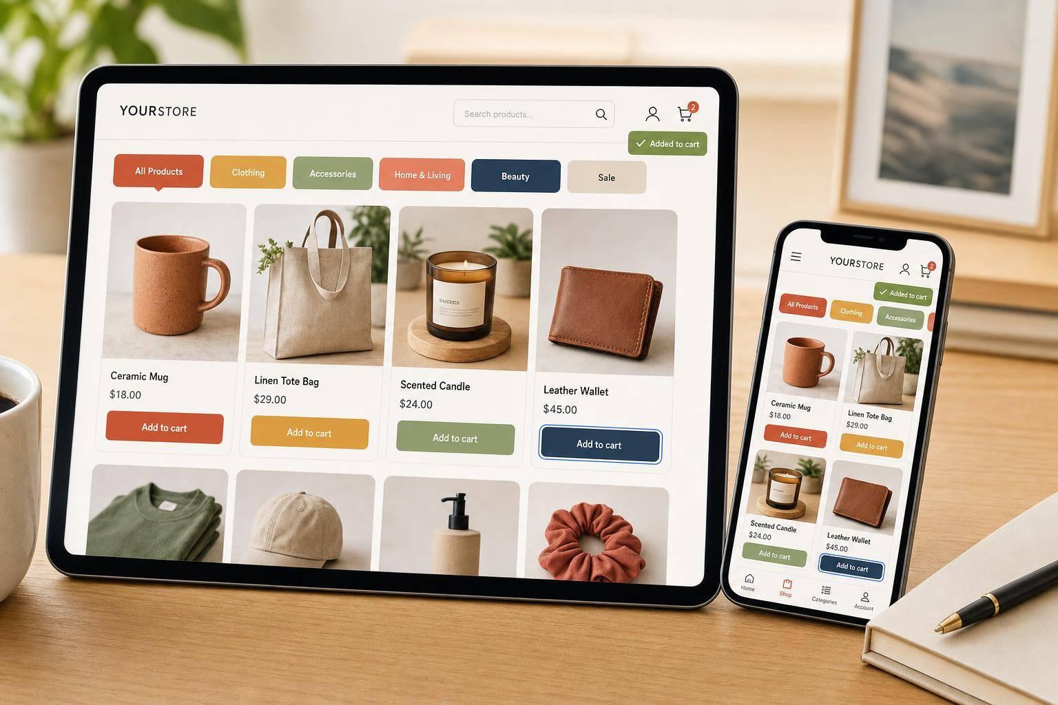
A tabbed menu is simple: customers tap a category, see the matching food, and add items without losing their place. That matters even more on phones, where small delays can hurt orders.
Quick comparison
| Layout | Best for | Main issue |
|---|---|---|
| Horizontal tabs | 3–7 categories on desktop and mobile | Can feel tight on small screens |
| Vertical tabs | Desktop or tablet menus with more categories | Takes up too much space on phones |
| Accordion | 8+ categories and phone-first menus | Needs more taps |
I’d treat this setup as a clean way to map categories, build the page, style the active tab, and test the order flow before launch.
Prepare categories and products for tab mapping
Next, map your menu categories to the tabs your layout will show. A simple setup works best: one tab = one WooCommerce category. That keeps the menu easy to scan and helps people find items without hunting around.
Create menu categories that work as tabs
Go to Products → Categories in your WordPress dashboard and set up one category for each main tab you want to display.
Stick with names customers know right away, like Burgers, Pizza, Drinks, and Desserts. Clear labels make the tab row easier to use.
Try to keep the top-level tab row to 5–7 categories. Once you go past that, the menu starts to feel crowded. If you have a big menu, use parent and child categories behind the scenes, but still keep the visible tab row to 5–7 top-level categories.
Assign each food item to the right category
Add each product to one clear category and make sure the regular price field is filled in. The tabbed menu uses that field to show pricing the right way.
It also helps to keep each product tied to one primary tab category. You can still use secondary categories for cross-listing, but the main category should match the tab where that item belongs.
Find the category slugs or IDs you may need
Some tab builders sort items by category slug or category ID. You can find both in Products → Categories.
Open Products → Categories, hover over the category you want, and click Edit. The slug shows up in the Slug field. The ID appears in the browser address bar as tag_ID=37.
Use the slug or ID when your tab builder asks for an exact category reference.
| Mapping element | Where to find it | Example | Best used for |
|---|---|---|---|
| Slug | Products → Categories → Edit → Slug field | burgers, lunch-specials |
Shortcodes and builder settings |
| ID | Browser URL when editing a category | 37, 42, 51 |
Plugin filters and menu builder mapping |
Use lowercase, hyphen-separated slugs like lunch-specials.
If you use FoodMaster – Restaurant Ordering Plugin, map each tab to the matching category ID in the menu builder. For example, Burgers might point to category ID 37, Pizza to 42, and Drinks to 51.
sbb-itb-7e654f7
Build the tabbed menu page in WooCommerce
Now it’s time to turn that category map into the page customers will use. Build it with a Tabs block or the page builder you already use.
Create the menu page and add the tab container
Go to Pages → Add New and give the page a name people will spot right away, like "Order Online" or "Restaurant Menu." In the Gutenberg editor, open the block inserter and look for a Tabs block. Add it near the top of the page so it acts as the main menu navigation.
Then rename each tab to match your WooCommerce categories, like Starters, Burgers, Pizza, Sides, Desserts, and Drinks. Try to keep the tab row to about 5–7 categories. If your menu is bigger than that, group similar items under one tab and split them with subheadings inside the tab panel. That keeps the page from feeling crowded.
Add category-based product lists inside each tab
After the Tabs block is set up, open each tab panel and place the right product list inside it. In Gutenberg, the WooCommerce Products by Category block makes this simple. Just pick the matching category in the block settings – Starters in the first tab, Burgers in the second, and so on.
If you’d rather use shortcodes, WooCommerce’s [product_category] shortcode is the standard option for showing products from one category. For example:
[product_category category="starters" per_page="12" columns="3" orderby="menu_order" order="asc"] You can change per_page and columns to match your layout. Want a tighter grid? Lower the column count. Need to show more items at once? Bump up per_page.
If you use FoodMaster – Restaurant Ordering Plugin, add its Menu Block or All Categories block inside each tab panel instead. FoodMaster pulls in items from the assigned category and keeps the ordering controls inside each tab, which makes the setup feel cleaner.
Keep your tab names short and plain. Customers shouldn’t have to guess where to click.
Check tab order and menu flow before publishing
Once the tab panels are in place, check the order and test the buying flow. Set the tabs in the sequence people usually expect when ordering: Starters → Mains → Sides → Desserts → Drinks. You can control this with the Order field in Products → Categories, or by dragging tabs around in your page builder. If you want to push promos, put Specials or other high-margin items closer to the front.
Before you publish, go through the page like a customer. Add items from two or three tabs and make sure the cart updates without a full page reload. Switching tabs shouldn’t empty the cart, and Add to Cart should keep shoppers on the same page.
After the structure is working, the next step is mobile behavior and styling.
Set mobile behavior and basic styling
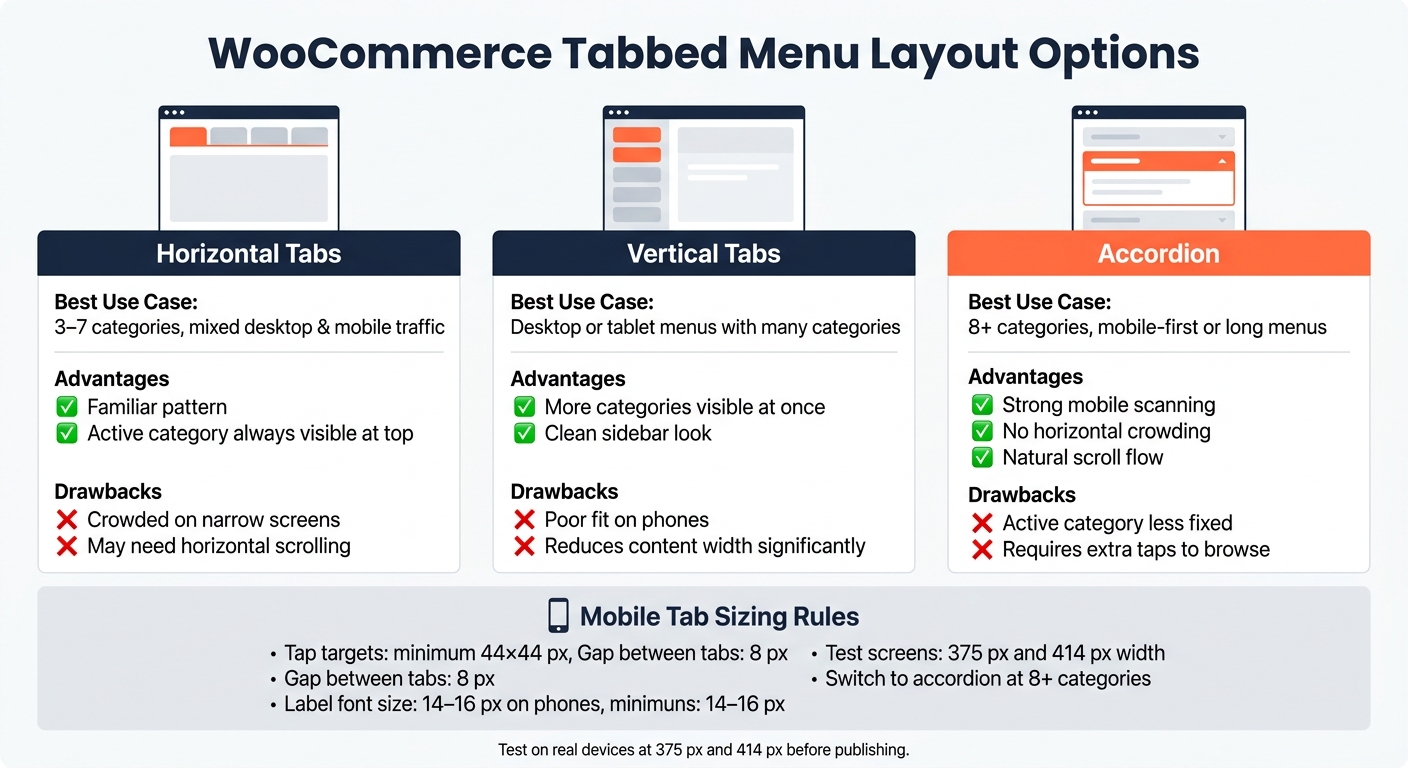
WooCommerce Tabbed Menu Layout: Which One Is Right for You?
Make tabs easier to use on phones
Now that the tab setup is in place, it’s time to make it work better on mobile and tighten up the visual states.
Keep the tab bar in a single horizontal row, and let it scroll once you get past 4–5 categories. That helps labels like "Burgers", "Pizza," and "Drinks" stay readable on smaller screens instead of getting squished.
A few mobile sizing rules matter here:
- Use tap targets of at least 44×44 px
- Leave 8 px between tabs
- Keep labels at 14–16 px on phones
If your menu has 8+ categories, switch the mobile nav to an accordion. At that point, tabs can start to feel cramped and awkward to swipe through.
Style active tabs and content areas
Give the active tab a brand-color state with white text and either a clear border or a bold label. Keep inactive tabs light so the selected state stands out fast.
For spacing, use 16–20 px of container padding and 12–20 px between product rows. Prices like $10.99 or $14.99 should be bold or slightly larger so they catch the eye right away. For readability, follow WCAG guidance and keep a minimum contrast ratio of 4.5:1 for body text.
If you’re using FoodMaster – Restaurant Ordering Plugin, a lot of this can be handled in the plugin settings. You can change active tab colors, content padding, and mobile breakpoints without writing CSS from scratch. And if the settings don’t cover a small detail, a short CSS block with media queries usually does the job.
Compare layout options before finalizing the design
Before you lock in the layout, compare horizontal tabs, vertical tabs, and accordion navigation based on your menu size and the devices people use most. Use the table below to pick the simplest fit.
| Layout Type | Best Use Case | Advantages | Drawbacks |
|---|---|---|---|
| Horizontal tabs | 3–7 categories, mixed desktop and mobile traffic | Familiar pattern; active category stays visible at the top | Becomes crowded on narrow screens; may need horizontal scrolling |
| Vertical tabs | Desktop or tablet menus with many categories | More categories visible at once; clean sidebar look | Poor fit on phones; reduces content width significantly |
| Accordion-style | 8+ categories; mobile-first, long menus | Strong mobile scanning; no horizontal crowding; natural scroll flow | Active category is less fixed; requires extra taps to browse |
Test at 375 px and 414 px in DevTools, then check it on a real phone too. That second step matters more than people think.
Conclusion: Publish, test, and refine the tabbed menu
Give the page one last pass before it goes live.
Final checks before going live
Stick with the same tab order and category mapping you used during the build, then test the live menu from top to bottom.
Check these areas:
- Category and product accuracy – Open every tab and make sure each product still sits in the right category.
- USD price formatting – Confirm every price uses consistent U.S. formatting: a dollar sign, a decimal point, and matching trailing zeros.
- Add-to-cart flow – Add items to the cart, change quantities, and test options like toppings or sizes. Then make sure the cart updates the right way.
- Mobile usability – Test on iOS and Android phones between 375–414 px wide. Tabs should be easy to tap, content should switch without friction, and nothing should force users to pinch and zoom.
- Layout and styling – Look for broken columns, overlapping elements, uneven image ratios, and product cards that don’t line up. The active tab should stand out, and spacing should make the menu easy to scan.
When the page clears those checks, start using live order data to fine-tune the layout.
After launch, review click and order data in WooCommerce reports and analytics or FoodMaster – Restaurant Ordering Plugin to reorder tabs and rename broad categories.
FAQs
How many tabs should I use?
Group the menu into clear tabs like appetizers, mains, sides, desserts, and beverages. Aim for seven to ten items per category.
That range helps cut down choice overload and makes the menu simpler to scan. Separate tabs also let customers jump between sections without reloading the page, which keeps the experience clean and easy to use.
Should I use tabs or an accordion?
In FoodMaster, the right layout depends on menu size and customer flow.
Use an accordion when you have lots of categories – especially large, multi-cuisine menus with eight or more sections. It shows one section at a time, which helps keep the page from feeling crowded.
Go with sticky tabs if you want customers to browse on a single scrolling page. This setup works best for menus that lean on visuals, like sushi bars or bakeries.
Why is my cart resetting between tabs?
This usually happens when the page fully reloads as customers switch menu tabs. That reload can interrupt the session, which is why the cart gets cleared.
To avoid that, use AJAX-based add-to-cart so customers stay on the same page while they browse. FoodMaster is built for this setup, with modal popups that keep shoppers on the menu page and help the cart stay intact as they move between categories.
Related Blog Posts
Commission-free ordering
Run restaurant orders on your own WordPress site
FoodMaster adds delivery, pickup, dine-in, POS, and kitchen tools — with zero per-order fees.