On this page
- Quick comparison
- What Slows Restaurant Checkout Down
- 1. FoodMaster – Restaurant Ordering Plugin
- Fewer Clicks from Menu to Checkout
- Mobile-First by Design
- Faster Checkout for Repeat Customers
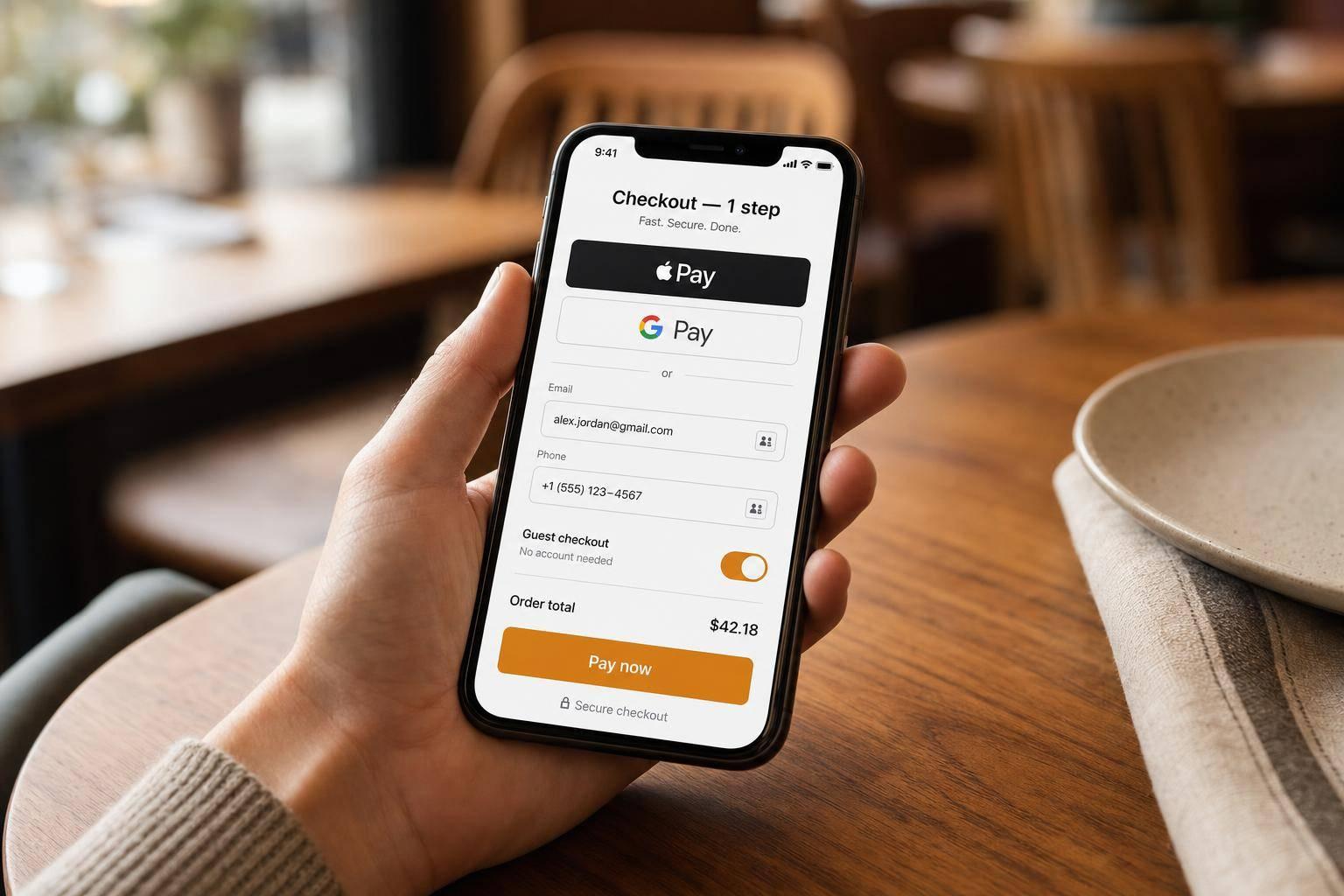
- Payment Without the Typing
- 2. One-Page Checkout
- Keep the Form Lean
- Faster for Returning Customers
- 3. Express Checkout
- Where Express Buttons Should Go
- More Options, Better Results
- Speed for Repeat Customers
- 4. Guest Checkout
- Why Forced Sign-Up Slows Checkout
- Move Account Creation After Checkout
- 5. Mobile-Optimized Forms
- Keep the Form Short and Laid Out for Phone Use
- Design for Phone Use, Not Desktop Use
- Catch Errors Before Submission
- 6. Autofill and Address Autocomplete
- Why Address Autocomplete Matters for Delivery Orders
- What to Autofill vs. What to Leave Manual
- 7. Digital Wallets
- Where to Place Wallet Buttons
- What to Prioritize for U.S. Customers
- 8. One-Click Reordering
- What Gets Saved
- Where to Put the Reorder Button
- When Items Are Unavailable
- How to Prioritize Checkout Fixes
- Checkout Fix Comparison Table
- Checkout Design Tips for Delivery and Pickup Orders
- How to Measure Results After Each Checkout Change
- Conclusion
- FAQs
- Which checkout fix should I implement first?
- How many checkout fields should a restaurant order form have?
- How can I tell if faster checkout is improving orders?
- Related Blog Posts
Most restaurant checkout drop-offs come from a few fixable issues: forced accounts, too many form fields, slow mobile forms, manual card entry, and unclear delivery or pickup steps.
If I wanted to cut checkout friction fast, I’d start here:
- Turn on guest checkout
- Cut the form down to 6–8 fields
- Use one-page checkout
- Add Apple Pay and Google Pay
- Use autofill and address autocomplete
- Make checkout easy on phones
- Let repeat customers reorder in one tap
The article’s main point is simple: when checkout asks for less work, more people finish their order. That matters even more in restaurant ordering, where over 60% of digital food orders happen on smartphones, and forced account creation can drive 19% to 26% of checkout drop-offs.
Quick comparison
| Fix | What it does | Best use |
|---|---|---|
| Guest checkout | Removes sign-up friction | First-time customers |
| Fewer form fields | Cuts typing and errors | All orders |
| One-page checkout | Keeps everything on one screen | Shorter checkout flow |
| Express checkout | Skips extra steps with wallet pay | Mobile users |
| Mobile-optimized forms | Makes checkout easier on phones | Phone-heavy traffic |
| Autofill & address autocomplete | Fills contact and address info fast | Delivery orders |
| Digital wallets | Cuts manual card entry | Apple Pay/Google Pay users |
| One-click reordering | Rebuilds past orders fast | Repeat customers |
| FoodMaster plugin | Ties menu, cart, and checkout together in WooCommerce | Restaurant sites using WooCommerce |
Bottom line: if you want more completed orders, remove account walls, shorten forms, show full costs early, and put the fastest payment options at the top.
sbb-itb-7e654f7
What Slows Restaurant Checkout Down
Restaurant checkout tends to slow down for a handful of familiar reasons: forced account creation, long forms, mobile-friendly restaurant layouts, manual card entry, and unclear delivery or pickup choices.
Forced account creation is one of the biggest problems. If someone is hungry and ready to order, they usually don’t want to stop and make an account first. That extra step is a common reason people leave, often driving 19% to 26% of checkout drop-offs.
Long forms are another major drag. Many checkout flows ask for far more than a restaurant order needs, often 14 to 23 fields, even though a lean setup can stay closer to 7 to 8. Things like company name, fax number, and extra billing fields just add more typing without helping the order. On a phone, that’s even more of a headache. Every extra field takes more time and makes validation errors more likely.
Mobile checkout makes all of this worse. More than 60% of digital food orders come from smartphones, so even small issues hit a lot of people. And when forms are hard to use on a small screen, the damage adds up fast: that difficulty drives 34% of mobile abandonment.
Manual card entry adds one more slow step. Typing card details into a phone takes longer and makes mistakes more likely. Around 30% of shoppers abandon when they’re asked to re-enter credit card information.
Unclear delivery and pickup choices can also stop a customer right at the finish line. If fees aren’t clear, timing feels vague, or address fields are confusing, people pause. And once they pause, some leave.
The next sections strip out these friction points one by one.
1. FoodMaster – Restaurant Ordering Plugin
FoodMaster is a WooCommerce restaurant ordering plugin built for restaurant ordering. It keeps menu browsing, cart review, and payment tied together, so customers can get to checkout with fewer taps.
Fewer Clicks from Menu to Checkout
FoodMaster uses pop-up item editors, which let customers pick toppings, change sizes, and add items to the cart without leaving the menu page or waiting for reloads. That matters on mobile, where every extra step can feel like a speed bump.
A sticky mini cart stays on screen with the running total and a one-tap checkout button, so checkout is always close by. From there, the checkout page can stay short and focused.
Mobile-First by Design
FoodMaster is built with mobile use in mind. Large tap targets, with a minimum size of 48px, vertically stacked forms, and scroll-friendly menu layouts help keep things smooth on small screens.
The checkout form can also be trimmed down to just the fields that matter for a restaurant order:
- Name
- Phone
- Delivery or pickup choice
- Address, if needed
- Payment
Optional fields can stay hidden, which cuts down on typing and helps customers move through checkout with less friction.
Faster Checkout for Repeat Customers
For returning customers, FoodMaster makes reordering much easier. Its one-click reorder feature lets people repeat past orders in seconds by pulling saved delivery addresses and order history from WooCommerce’s native account system.
Payment Without the Typing
FoodMaster works with WooCommerce payment gateways like Stripe and Square, which means restaurants can offer Apple Pay and Google Pay through supported gateways. On mobile, that can make a big difference. Wallet buttons can lift checkout completion rates by 20–30%.
FoodMaster also includes a pre-payment tip step, so customers can confirm the full order total before they pay. When payment gets this easy, the next place to cut time is the rest of the checkout form.
2. One-Page Checkout
Multi-step checkout adds friction. A one-page checkout keeps contact details, delivery or pickup, and payment on the same screen. That alone makes the process faster. But the bigger win often comes from trimming the form itself.
Why does this matter so much? Because every extra page gives people one more chance to leave before they place the order. In one test across 606 transactions, single-page checkout beat multi-step flows by 21.8%. Another test pushed conversion from 54% to 57%.
Keep the Form Lean
A restaurant online ordering website checkout only needs a handful of sections:
- Contact info
- Delivery or pickup selection
- Address for delivery
- Pickup time or order time
- Payment
Cut optional fields like company name, second address line, and country for local orders. And if billing and delivery are usually the same, match them by default.
Faster for Returning Customers
For repeat buyers, saved details can prefill the name, phone number, and address. That means fewer taps, less typing, and a smoother path to checkout. If you want to make it even faster, the next move is to set up online ordering with express checkout features.
3. Express Checkout
After you trim down the checkout page, the next win is simple: skip as much of it as possible.
That’s where express payment comes in. Express checkout cuts out extra steps and moves customers from cart to payment fast. Instead of making people work through a long checkout flow, it gives them a short path to pay, often with one tap using Face ID or Touch ID. And that speed matters. More than 60% of digital food orders start on smartphones. On a small screen, every extra field feels like a chore.
The aim is straightforward: keep cart review, delivery or pickup, and payment on one short path.
Where Express Buttons Should Go
Placement makes a big difference. If someone is hungry and ready to order, they shouldn’t have to scroll past forms before they see a fast way to pay.
Put Apple Pay and Google Pay buttons above the fold in the cart or checkout, before the order summary and before any form fields. That puts the fastest option front and center, right when intent is highest.
The copy around those buttons matters too. A clear express-checkout message in the cart increased conversions by 10.7%.
More Options, Better Results
Placement is one part of the story. The number of express payment choices matters too.
Offering more than one express checkout tool gives customers more ways to take that short path. Data from Ecommpay and IMRG shows that stores with four express checkout options reach around 67% checkout conversion, compared to 52% for stores with none.
Put plainly: more express options mean more chances for a fast checkout.
Speed for Repeat Customers
For returning customers, express checkout works best when payment and shipping details are already saved.
Stored payment and address details make meal reorders almost instant. And for people who still don’t want to sign in, guest checkout removes the last barrier.
4. Guest Checkout
Guest checkout removes the account step that still slows down even a fast payment flow. For restaurant orders, that matters a lot. When someone is ready to buy, the last thing you want is a sign-up screen getting in the way. Once payment is fast, the next big point of friction is often the account wall.
Baymard‘s survey of 1,026 U.S. adults found that 18% abandoned an order simply because they didn’t want to create an account. Across broader e-commerce research, forced registration drives roughly 19–24% of checkout abandonments. Guest checkout cuts out the registration form and password step, so customers can go straight to contact info, delivery or pickup details, and payment.
Why Forced Sign-Up Slows Checkout
Placement matters just as much here as it does with express payment buttons. Make guest checkout the default on the first screen, not a tiny link tucked under sign-in. When guest checkout is the default option, instead of being buried below the login form, conversion can improve by 20–23% compared to login-first layouts.
Baymard’s guidance is direct: use a clear button like "Continue as Guest" and place it above or next to the sign-in fields. People shouldn’t have to hunt for the faster path.
Move Account Creation After Checkout
After the order is placed, take account creation out of the checkout flow. Ask customers to create an account on the confirmation page or in the receipt email instead. That keeps the first order quick while still making repeat orders easier later on.
Research shows registered customers convert at around 64% on repeat orders, compared to roughly 52% for guests. So the smarter move is to close that gap after checkout, not before it. After that, the remaining fields need to be easy to finish on a phone.
5. Mobile-Optimized Forms
Once guest checkout removes the account step, the form becomes the last place where people get stuck. And on restaurant sites, that matters a lot because most orders happen on phones. So mobile checkout needs to feel fast, short, and easy to use with one thumb.
Keep the Form Short and Laid Out for Phone Use
For pickup, ask for name, phone number, email, and payment. For delivery, add the address fields. That’s it. Skip anything that doesn’t help complete the order – no company name, no second address line, and no country field for local orders.
Try to keep the form at 6–8 fields max. Use a single-column layout so each step feels simple on a small screen. Make tap targets large enough to hit without zooming in, and keep a sticky Place Order button at the bottom so the next step is always close by.
Design for Phone Use, Not Desktop Use
A mobile form should act like a mobile form. Use the phone keypad for phone numbers and the numeric keypad for ZIP codes and card fields. Small choices like this save taps and cut down mistakes.
Native date pickers and select menus for order type also help. They make the form feel more familiar and reduce confusion.
Catch Errors Before Submission
Inline validation checks each field as the customer types. If there’s a problem, show it right next to the field with a clear message like "Please enter a valid ZIP code" instead of throwing a vague alert at the top of the page.
Just as important: keep everything the customer already entered. If someone has to fill out the whole form again after one error, there’s a good chance they’ll give up.
Use always-visible labels above each field instead of placeholder-only text. When labels stay in view, people always know what belongs in each box.
Once the form is easy to finish on a phone, autofill and saved payment details can make checkout even faster.
6. Autofill and Address Autocomplete
Even a short form can feel slow when customers have to type every field by hand.
Browser autofill cuts out that friction. It can pull saved details like name, email, phone, and address straight from the browser, so the customer doesn’t have to do the work again. To make that happen, use standard HTML field types and matching autocomplete values. That helps browsers fill in name, email, phone, and address on their own. Test it on both desktop and mobile, because autofill behavior can change from one device to another.
Once you’ve trimmed the form, autofill takes care of the last bits of typing.
Why Address Autocomplete Matters for Delivery Orders
Typing a full delivery address on a phone is a pain. It’s slow, easy to mess up, and one small typo can send an order to the wrong place.
Address autocomplete, often powered by Google Places or a similar API, lets customers choose a suggested address in just a few taps. The rest fills in automatically. That means fewer keystrokes, fewer errors, and a faster path to placing the order.
Keep the suggestions focused on U.S. addresses and your delivery area. That way, customers see options that make sense instead of a long list of irrelevant results. Use autocomplete where it helps delivery accuracy, and stop where it doesn’t.
What to Autofill vs. What to Leave Manual
A simple split works best:
- Autofill the street address, city, state, and ZIP code
- Keep apartment numbers and delivery notes manual
- Remove address fields for pickup orders
With less address typing, digital wallets can move checkout along even faster.
7. Digital Wallets
Once autofill cuts down typing, digital wallets remove the last hands-on payment step. Entering card details on a phone slows checkout and leads to mistakes. Wallets replace that friction with a few taps and biometric confirmation.
Stripe network data shows wallet-based checkouts average about 42 seconds, compared with 85 seconds for manual card entry. And Stripe’s experiments found that adding Apple Pay increased conversion by 22.3% and revenue by 22.5% for eligible businesses. So this isn’t just about speed. It also helps more shoppers finish the purchase.
Where to Place Wallet Buttons
Placement matters. Put wallet buttons above the card form, right at the top of the payment section, so customers see the fastest path first. They shouldn’t have to scroll past a full form just to find the easier option.
On mobile, make the buttons large enough to tap without effort. They should also stand out clearly from the standard card fields, so the fast option is easy to spot at a glance.
What to Prioritize for U.S. Customers
Start with Apple Pay and Google Pay. Those two cover most U.S. customers, so they should come first. For Apple Pay, you’ll need domain verification and HTTPS.
For repeat customers, saved wallets and one-click reorder make checkout even faster.
8. One-Click Reordering
Once payment and form friction are out of the way, one last slowdown remains: building the same order all over again. One-click reordering removes that step by bringing back a past order in seconds. For repeat customers, the fastest checkout often feels like no checkout at all – just a cart that’s already rebuilt.
This matters most for regular buyers: the office manager placing the same Monday lunch order for 12 people, or the family ordering the same Friday night combo every week. For them, rebuilding a cart is just extra hassle. One-click reorder turns a familiar purchase into something close to automatic.
What Gets Saved
A reorder has to bring back the right details. That includes:
- Items
- Modifiers like toppings, spice levels, and special instructions
- Quantity
- Order type, such as delivery or pickup
When all of that is saved, the reorder mirrors the customer’s usual meal without any reconfiguration.
Where to Put the Reorder Button
The Reorder button should be easy to spot on the order history page and the account dashboard, so customers don’t have to hunt through the menu to find it. In WooCommerce, put the button in My Account → Orders and send users straight to checkout.
When Items Are Unavailable
If something from the past order isn’t available, leave it out and show a clear notice before checkout. That keeps the process fast and reliable, even when the menu changes.
Pair one-click reorder with saved login and payment details, and repeat checkout becomes a quick confirmation.
Next, rank these fixes by impact so you know what to tackle first.
How to Prioritize Checkout Fixes
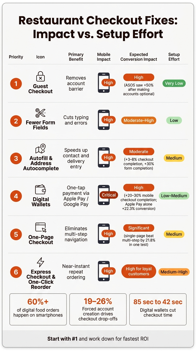
Restaurant Checkout Fixes: Impact vs. Setup Effort
Not every checkout fix pulls the same weight. Some changes knock out major friction right away, while others help more at the margins. So start with the fixes that remove the biggest blockers first.
Here’s the best order to follow:
- Enable guest checkout first.
- Reduce required fields.
- Turn on autofill and address autocomplete.
- Add digital wallets.
- Move to one-page checkout.
- Add express checkout and one-click reordering.
FoodMaster supports this phased approach inside WooCommerce. You can enable guest checkout, customize checkout fields, support digital wallets through compatible gateways, and offer one-click reordering from order history from one WooCommerce setup.
The table below sums up the priorities and the likely impact of each change.
| Priority | Fix | Expected Impact |
|---|---|---|
| 1 | Guest checkout | Removes the account barrier and reduces first-time abandonment |
| 2 | Fewer form fields | Cuts typing and speeds up completion on both desktop and mobile |
| 3 | Autofill & address autocomplete | Makes mobile checkout faster and reduces address errors |
| 4 | Digital wallets | Speeds up payment with tap-to-pay and saved details |
| 5 | One-page checkout | Creates a cleaner flow with fewer page loads |
| 6 | Express checkout & one-click reorder | Gives returning customers a near-instant path to order again |
Checkout Fix Comparison Table
This table compares impact, mobile use, and setup effort. Use it to go after the fastest wins first.
| Checkout Fix | Primary Benefit | Mobile Impact | Expected Conversion Impact | Setup Effort |
|---|---|---|---|---|
| Guest Checkout | Removes account creation | High – fewer taps | High – removing mandatory accounts can lift completed transactions, and ASOS reported a 50% increase after making accounts optional | Very Low – simple WooCommerce settings change |
| Fewer Form Fields | Cuts checkout time and errors | High – less scrolling on phones | Moderate to High – directly reduces drop-off between cart and payment | Low – simple checkout field settings |
| Autofill & Address Autocomplete | Cuts typing for contact and delivery info | High – autocomplete reduces address entry to a few taps | Moderate – autocomplete has been shown to improve form completion by about 30% and can lift overall checkout completion by 3–8% | Medium – requires Google Places API integration and field mapping |
| Digital Wallets | One-tap payment with saved card and address details | Critical – removes card typing altogether | High – merchants enabling Apple Pay or Google Pay often see 20–30% improvement in mobile checkout completion | Low to Medium – gateway setup plus Apple Pay domain verification |
| One-Page Checkout | Keeps checkout on one screen | High – eliminates page reloads and multi-step navigation | Significant – fewer page transitions reduce drop-off points | Medium – requires top WooCommerce food ordering plugins configuration and mobile testing |
| Express Checkout | Skips most fields for returning customers | High – reduces checkout to a few taps for repeat orders | High – especially effective when combined with saved addresses and digital wallets | Medium to High – needs saved customer data, gateway support, and UI changes |
| One-Click Reordering | Lets repeat customers reorder from order history | High – ideal for lunch-break or late-night mobile orders | High for loyal customers – improves order frequency | Medium to High – requires account-based ordering, cart logic, and My Account UI updates |
Once the biggest friction points are out of the way, use that same speed-first mindset for delivery and pickup layouts. Next, match these checkout fixes to optimized delivery and pickup layouts.
Checkout Design Tips for Delivery and Pickup Orders
Once you’ve cut down form and payment friction, the next wins usually come from one thing: making fulfillment and pricing easy to spot.
Start with the delivery or pickup choice at the top of checkout, before address fields or time slots. Keep the options plain and direct, like Delivery to your address and Pickup from [Restaurant Name]. A short line under each option helps set expectations fast. Then use conditional logic to hide delivery-only fields when someone picks Pickup. That way, people see only what matters to them.
Right after that, show timing. If the kitchen is open, lead with ASAP (about XX–YY minutes). Then offer a scheduled option with time slots that are easy to tap, such as 6:00–6:30 PM and 6:30–7:00 PM. For pickup orders, spell out the ready window with text like Pickup ready in about 20–30 min. If a slot is full, disable it so no one hits a dead end.
Before customers get to payment, show the full cost. This part matters. Surprise fees are one of the fastest ways to lose an order. A clean summary should follow this order:
- subtotal
- delivery fee
- service fee (if any)
- sales tax
- tip
- total
Use standard U.S. dollar formatting: $12.99, not "12.99" or "USD 12.99." For taxes, use Sales tax or Estimated sales tax, and calculate it automatically based on the delivery address or the pickup location.
For tipping, keep it simple. Offer three or four preset buttons like 15%, 18%, 20%, and No tip. Each button should show both the percent and the dollar amount, such as 18% – $3.24. Add a Custom tip amount field for anything outside those presets. Setting a common option like 18% by default is okay, as long as customers can change it in one tap.
On mobile, keep a fixed bottom bar with the total and the Place Order button, such as Pay $28.47. That keeps the amount in view and lets people finish checkout without extra scrolling. And don’t tuck tips or fees inside accordions. Next, measure whether these changes reduce completion time and abandonment.
How to Measure Results After Each Checkout Change
Once the new checkout flow goes live, the next step is simple: check whether it actually cuts friction.
Before you change anything, record your baseline numbers. That means checkout completion, completion time, abandonment rate, payment success, and repeat order frequency. If you skip this step, you won’t know whether the update helped or just changed the numbers.
Use these formulas:
- Checkout completion rate = completed orders ÷ checkout starts × 100
- Cart abandonment rate = abandoned carts ÷ add-to-cart sessions × 100
- Payment success rate = successful payments ÷ payment attempts × 100
Keep payment failures under 5% of attempts. If that number is higher, look at the usual trouble spots: gateway errors, failed redirects, or clunky form fields that slow people down or push them out of the flow.
Because FoodMaster stores all order data in WooCommerce order data, you can pull these numbers from WooCommerce analytics and reporting. You can also use Google Analytics 4 with UTM parameters to see which checkout edits led to completed orders. That gives you a clearer picture of what changed, not just whether sales moved.
Focus on what happened after the update:
- Did checkout time go down?
- Did completed orders go up?
- Did repeat orders increase?
Then look at both the direction and the size of the shift before deciding whether to keep the change.
One more thing: test one change at a time. Review results weekly, but wait for two to four weeks of data before making a call. Small samples can get thrown off by lunch rushes, dinner patterns, weekends, or local events. A clean before-and-after read comes from comparing the same two-week window while keeping menu pricing and promotions the same.
For repeat order frequency, check whether a faster checkout leads to more second orders within 30 days. In WooCommerce customer analytics, review how many customers place a second order during that period. Also watch whether orders per customer move up after the update.
Keep the changes that make checkout faster and help more people finish their orders. Cut the ones that don’t.
Conclusion
Fast restaurant checkouts cut friction. The best fixes don’t add more steps – they take steps away.
Guest checkout, digital wallets, and shorter forms tend to make the biggest dent in checkout speed and cart abandonment. And mobile-first checkout is a must, because most food orders begin on phones. These changes work best when they sit inside one smooth checkout flow instead of being patched together.
FoodMaster brings these checkout fixes into one WooCommerce workflow. That gives teams one place to test changes and improve checkout speed without jumping between tools. A smart place to start is simple:
- Guest checkout
- Apple Pay
- Google Pay
- Fewer required fields
After that, add saved details and one-click reordering for repeat customers. You can also boost retention by adding a loyalty program to reward frequent diners.
FAQs
Which checkout fix should I implement first?
Start with express checkout options like Apple Pay and Google Pay. On mobile, those one-tap payments cut extra steps at the moment that matters most. And that can lift conversion rates by 20% to 30%.
To get them live, make sure your SSL certificate is valid and turn on Payment Request Buttons in your payment gateway settings. Then enable guest checkout and trim down form fields so fewer shoppers drop off before they finish.
How many checkout fields should a restaurant order form have?
Use a single-page checkout with only the fields people need. That cuts friction, lowers cart abandonment, and helps more shoppers finish their purchase.
Stick to the basics:
- Name
- Delivery address
- Phone number
- Payment details
If the billing address is the same as the delivery address, hide those extra fields. No one wants to type the same thing twice.
You can also auto-fill the city and state from the ZIP code. It saves time and makes the whole process feel smoother.
On mobile, speed matters even more. Add Apple Pay or Google Pay so shoppers can check out in a few taps instead of filling out a long form.
How can I tell if faster checkout is improving orders?
Track your conversion rate to see if more visitors finish an order. Then keep an eye on your cart abandonment rate to see if fewer shoppers leave during payment.
The key is to compare both numbers over time against your baseline. And don’t stop at overall site data. Check mobile-specific conversion data too, since smoother updates like digital wallets are meant to cut drop-offs on phone orders.
Related Blog Posts
Commission-free ordering
Run restaurant orders on your own WordPress site
FoodMaster adds delivery, pickup, dine-in, POS, and kitchen tools — with zero per-order fees.