On this page
- Quick comparison
- 1. Simplify menu categories and navigation
- 2. Write shorter item descriptions and cleaner menu cards
- 3. Make item customization faster and clearer
- 4. Show pricing, taxes, fees, and prep times upfront
- 5. Cut checkout steps and unnecessary form fields
- 6. Make delivery, pickup, curbside, and scheduling options clear
- 7. Keep the cart visible and easy to update
- 8. Build the ordering flow for mobile first
- 9. Add clear checkout reassurance and order confirmation
- 10. Use WooCommerce restaurant tools like FoodMaster to improve the ordering flow
- Before-and-After Ordering UX Improvements
- Conclusion
- FAQs
- Which UX fix should I prioritize first?
- How can I tell where customers drop off?
- What should I test on mobile first?
- Related Blog Posts
If your online ordering flow feels slow on a phone, you’re likely losing orders. This article shows me that the biggest fixes are simple: make the menu easier to scan, show full costs early, trim checkout fields, keep the cart in view, and make pickup or delivery choices obvious.
Here’s the short version:
- Online and phone orders drive 67% of restaurant revenue
- About 60% of food orders come from mobile
- 48% of shoppers leave when extra charges show up late
- Long menus, messy modifiers, and too many checkout fields lead to drop-off
So if I want more completed orders, I should focus on:
- clearer menu categories
- shorter item descriptions
- faster customization
- upfront fees and prep times
- fewer checkout steps
- clear pickup, delivery, curbside, and scheduling options
- a visible cart
- mobile-first design
- trust cues and strong order confirmation
- the right WooCommerce restaurant tools
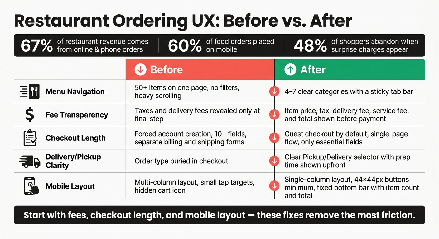
Restaurant Ordering UX: Before vs. After Fixes That Reduce Drop-Off
Quick comparison
| Area | What hurts orders | What helps |
|---|---|---|
| Menu | Too many items, vague categories | Clear categories, sticky navigation |
| Item cards | Long text, cluttered layout | Short copy, clean cards, clear price |
| Modifiers | Confusing options, hidden price changes | Grouped choices, inline price updates |
| Pricing | Fees shown late | Full cost shown before payment |
| Checkout | Forced signup, too many fields | Guest checkout, fewer fields |
| Fulfillment | Buried pickup/delivery choices | Clear options with times and fees |
| Cart | Hard to find or edit | Sticky cart with fast updates |
| Mobile | Small tap targets, heavy pages | Single-column layout, wallet pay, sticky bar |
| Trust | Weak payment reassurance | Security cues, clear confirmation |
| Tools | Basic store flow | Restaurant-focused WooCommerce setup |
Bottom line: this guide is about cutting friction at every step so more customers finish their order instead of leaving halfway through.
sbb-itb-7e654f7
1. Simplify menu categories and navigation
Customers bail on orders when they can’t find what they want fast. That’s why clear category names and a simple menu matter so much. Use labels people know right away, not vague ones like "Chef’s Specials" or "Favorites" when they’re trying to get to a food type. Think Starters, Burgers, Sandwiches, Sides, Desserts, and Drinks. The shorter the path to the right item, the fewer people drop off before checkout. Usability testing shows that unclear categories slow item discovery, even on menus people already know.
There’s another trap here: too much choice in one place. Cornell’s School of Hotel Administration recommends 7–10 items per category; once a section gets too crowded, orders tend to fall. In one case, a restaurant took an 18-item seafood section and split it into three subcategories. The result? Browsing time dropped by 22 seconds, and order value went up by 17%.
A sticky category bar helps too. It lets customers jump to Pizza or Drinks without scrolling all the way back to the top. In practice, that means setting up fixed tabs or anchored sections in your restaurant plugin options and keeping the main category bar to about 5–7 categories so it stays easy to read. It’s a small change, but it cuts down the clicks between landing on the page and adding something to the cart.
Once navigation is clear, the next step is making each item easy to scan and customize.
2. Write shorter item descriptions and cleaner menu cards
Once customers land in a category, the item copy and card layout should make scanning easy. People skim menu cards. They don’t read long blocks of text. If descriptions run too long, choices take more time and drop-off goes up. A good target is 15–30 words per item: enough to explain the dish, not so much that it slows the scroll.
A good description covers three things: what it is, what’s in it, and why it stands out. For example, "Smoky BBQ Chicken Pizza – grilled chicken, red onions, mozzarella, house BBQ sauce (medium spicy)" says a lot in one line. It works especially well on mobile, where space is tight and people move fast.
Layout matters just as much as the wording. When each card uses the same pattern – bold item name, short description, clear price, dietary badges, and one "Add to Cart" button – customers can scan the list without stopping to figure out each card. If the cards don’t match, the menu feels harder to use.
In WooCommerce, use the short description field for that scannable line on the menu page. Save extra details, like allergy notes, for a modal or the product detail page so the main menu stays clean. For dietary and allergen info, small standard badges such as GF, V, or a chili icon work well without clutter. Keep it to 2–3 badges per item.
On mobile, keep descriptions to one or two lines, show prices in clear $0.00 format, and use 44×44 pixel tap targets.
With item cards easier to scan, the next friction point is customization.
3. Make item customization faster and clearer
Once a customer picks an item, the modifier flow needs to stay just as easy to scan. This is where orders often bog down or fall apart. Most restaurant orders include at least one modifier – size, toppings, spice level, or sides – and any friction here can push people to leave.
A simple fix is to group modifiers into clearly labeled sections with short, direct headers like "Choose your size" or "Pick a sauce." Put required choices first and spell out the rule, like "Required – choose 1." Then place extras after that with labels such as "Optional – choose up to 3." That order fits the way people usually decide: deal with the must-have stuff first, then look at add-ons.
Try to keep the setup tight. Limit items to 3–4 modifier groups with about 7 options each. Once the list gets bigger than that, people slow down.
The control type matters too:
- Radio buttons work best for one required choice, like size or crust.
- Checkboxes fit multi-select extras, like toppings.
- Quantity steppers make sense for repeat add-ons, like extra sauces.
Avoid dropdowns when you can. They hide choices and add extra taps, which is a pain on mobile.
You also want to show price changes inline, right next to each option. Something like "Add bacon +$1.50" or "Gluten-free crust +$2.00" removes guesswork about the final total. Put the running total near "Add to Cart." When people can see what they’re paying as they customize, they move with more confidence and leave less often. A clean add-on layout also makes it easier to add extras without dragging down checkout, a key feature of an efficient restaurant website ordering system.
Once customization is clear, the next friction point is pricing and timing.
4. Show pricing, taxes, fees, and prep times upfront
Unexpected costs and shifting wait times are a big reason people bail on food orders. Baymard Institute data found that 48% of shoppers leave checkout when they run into unexpected charges – including taxes, delivery fees, or service fees they didn’t see earlier in the flow. For restaurants, that can turn into a lot of lost sales from people who were ready to order.
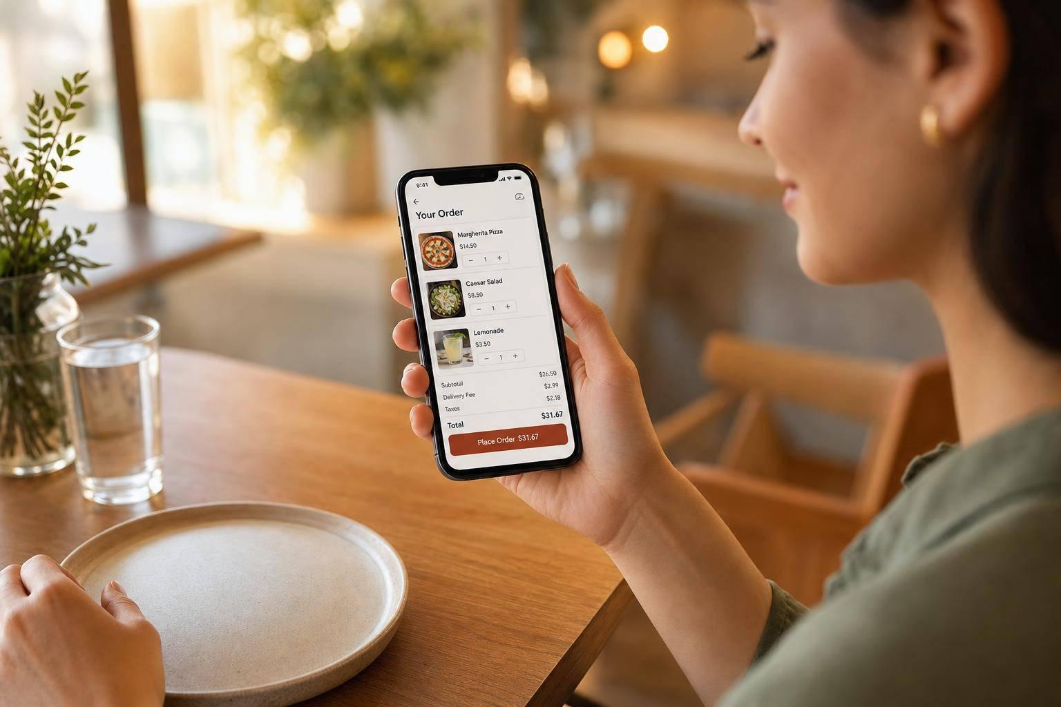
After customers pick their items, show the full cost before checkout starts to feel like a black box. Put the item price on the menu card, then show fees clearly in the cart. Once someone chooses delivery or enters a ZIP code, surface a plain-English cart summary with labels like "Delivery fee: $3.99", "Service fee: $2.00," and "Est. tax: $1.65" so nothing feels hidden or fuzzy.
Prep times should be just as clear. Place them right next to the fulfillment option: "Pickup – Ready in 15–20 minutes" or "Delivery – Est. 30–40 minutes." And use 12-hour time with AM/PM, like 6:45 PM, since that fits U.S. expectations.
On mobile, a sticky footer works well because it keeps the subtotal, fees, and estimated total in view as people move through the page. On the last checkout screen, repeat the full line-item breakdown right above the "Place Order" button so the final amount never comes out of nowhere. It also helps to add an info icon for service and packaging fees with a one-line explanation.
Then, once pricing and timing are clear, the next step is to make payment and fulfillment choices just as easy to understand.
5. Cut checkout steps and unnecessary form fields
Once the price and timing feel clear, a long checkout can still kill the sale. Baymard found that the average U.S. checkout has 23.48 form elements. But a lean flow can work with as few as 12 total. That’s the goal: fewer fields, fewer choices, less friction.
Start by cutting anything that doesn’t help finish the order. Remove fields like company name, fax, separate billing address, and extra address lines. If someone needs to add an apartment or suite, tuck that behind an "Add apartment or suite" link instead of showing it to everyone up front. Keep the form focused on the basics:
- Name
- Phone
- Fulfillment choice
- Delivery address when needed
- Payment details
That’s usually enough.
Account creation causes trouble too. If you force people to register before they can buy, many will leave – especially if they’re ordering in a hurry. Enable guest checkout by default and push "Create an account" to the confirmation screen instead.
Then clean up the flow itself. A single-page checkout helps people review the order, fill in details, and pay without jumping from page to page. Add address autocomplete and inline validation so typing takes less effort and mistakes get fixed on the spot. Once checkout is trimmed down, the next step is making fulfillment options easy to spot.
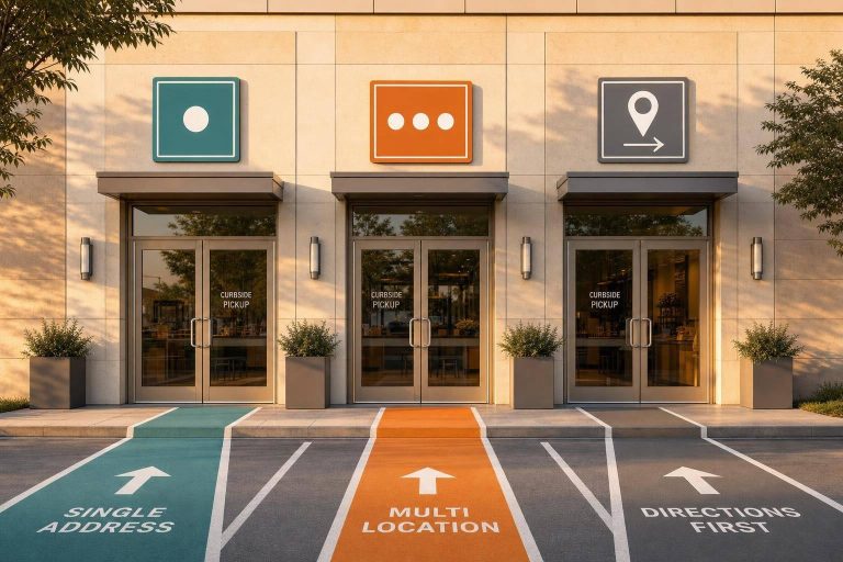
6. Make delivery, pickup, curbside, and scheduling options clear
Once checkout fields are trimmed down, the next thing customers should be able to decide fast is how the order gets to them. This isn’t a minor detail. Nearly 75% of all restaurant traffic now happens through pickup and delivery, so fulfillment sits at the center of the order.
The job here is simple: make each option easy to read before the customer taps.
Use direct labels and put them up front. Skip vague wording like fulfillment option and use terms people know right away:
- Pickup
- Delivery
- Curbside Pickup
- Schedule for Later
Add a short line next to each one so the customer gets the picture fast. For example: Ready in 20–30 minutes, Arrives in about 45 minutes, or Park in a curbside space and text when you arrive. That small bit of context can save people from stopping to figure things out.
Fees, timing, and hours should appear at the moment of choice. If delivery has a fee and pickup is free, say so there. If a method only works during certain hours, show those hours before the customer selects it. For curbside, include a short instruction block so guests know exactly what to do when they arrive.
Timing matters just as much as naming. A consumer survey summarized by SimpleTexting found 51% of diners said long wait times were the most frustrating part of curbside pickup. That’s why estimated times need to be clear and realistic, not vague or wishful.
For scheduled orders, keep the flow tight. Show only As soon as possible and Schedule for later first. Then, only if the customer picks the future-order path, reveal the available time slots. Use plain, specific language like Today, 6:00 PM instead of generic prompts like Select time. If a slot can’t be booked, disable it.
On mobile, make the tap targets large, and keep the chosen method visible throughout the cart and checkout. People shouldn’t have to backtrack just to remember whether they picked delivery or pickup.
7. Keep the cart visible and easy to update
After customers pick pickup or delivery, the cart should stay in view so they can check it and make changes before checkout. At that point, the cart becomes the hub of the whole order. And with restaurant orders, people often build meals item by item while keeping an eye on the total. If the cart vanishes or makes edits a pain, it’s easy for that order to die halfway through.
Use a persistent cart that stays on screen while the customer browses the menu. On desktop, a sticky right sidebar can show the item list, subtotal, and a clear "Checkout" button. On mobile, a sticky bottom bar works well. Show the item count and running total, then let users tap to open a slide-up cart panel. The goal is simple: customers shouldn’t have to hunt around for their order.
Just as important, the cart needs to be easy to edit. Customers should be able to:
- change quantities with plus and minus buttons
- remove items with one tap
- edit customizations with their earlier choices already filled in
And they should be able to do all of that without leaving the menu or waiting for the page to reload. AJAX-powered cart updates help here. Changes happen right away, and the subtotal, fees, and estimated total update on the spot.
The cart should also show the details people need before checkout in one place: item names, quantities, totals, and fulfillment method. If you offer a free delivery threshold, show progress toward it with copy like "$6.00 away from free delivery." Unexpected delivery fees are a major source of abandonment on restaurant sites, so clear cart details make checkout feel much simpler. This matters even more on mobile, where the cart has to stay visible without taking over the screen.
8. Build the ordering flow for mobile first
Mobile drives most online food orders, so your ordering flow should start there. 60–70% of online food orders now come from mobile devices, which means the whole path – menu, customization, cart, and checkout – needs to work well on a phone, with one hand.
The cart may already be easy to reach. The menu should feel just as easy to move through. A single-column layout works best on small screens, and sticky tabs or anchor links help people jump to sections fast without a lot of scrolling.
Touch targets matter more than many restaurant owners think. Apple recommends a minimum of 44×44 pixels; Google recommends 48×48 pixels for tappable elements. Keep every tap target at least 44×44 pixels, with 8 px between controls. When buttons sit too close together, people tap the wrong thing, get annoyed, and take longer to finish the order.
After that, focus on thumb reach. Put the main action button near the bottom of the screen, where it’s easy to hit. On phones, a sticky bottom bar for the order total and checkout action makes the flow feel much smoother. Speed matters too, so keep pages light with optimized WebP images, lazy loading, and as few scripts as you can get away with.
Checkout should stay short – just two or three steps. Support Apple Pay and Google Pay, too. Digital wallets can reduce cart abandonment by 10–20% because one-tap payment removes extra friction on mobile. That leaves one last sticking point: giving people enough confidence right before they place the order.
9. Add clear checkout reassurance and order confirmation
After the customer fills in the last field, confidence is the last hurdle. Right before payment, add a few clear trust cues to ease hesitation.
Put a secure checkout label with a lock icon directly above or beside the payment button. Show payment logos near the card fields. Add a short line like PCI-compliant payments and SSL encryption so customers know their data is protected. Keep it tight. A study of 493 retailers found that using more than two trust seals can lower purchase completion rates.
Also show your restaurant’s phone number in standard U.S. format, such as (555) 123-4567, plus your full street address with city, state, and ZIP code. On mobile, make the phone number tap-to-call.
Once the payment step feels safe, the confirmation screen should remove any doubt about what happens next. A good confirmation page answers three things right away: Did the payment go through? What did I order? When and where do I get it?
Lead with a bold success message like Order confirmed. Then show the order number, item summary, full cost breakdown, and pickup or delivery details – such as Ready for pickup between 6:50–7:05 PM – in a clear format.
Send an automatic email or SMS confirmation the moment the order is placed. Transactional notifications like order confirmations have an open rate exceeding 90%, which makes them one of the most dependable ways to close the loop.
Main Street Pizza: Order #1247 is confirmed for pickup at 7:10 PM. Questions? Call (555) 123-4567.
10. Use WooCommerce restaurant tools like FoodMaster to improve the ordering flow
FoodMaster brings these UX fixes into a single WooCommerce ordering flow. Here’s what that looks like on the page.
For menu navigation, FoodMaster includes Accordion, Side Menu, and Sticky Tabs layouts. That gives restaurants a better fit for small, medium, and large menus, while helping customers move through items fast without feeling lost.
Then comes customization. FoodMaster lets customers pick toppings, sizes, and add-ons with extra options built into the item view. They can use radio buttons, checkboxes, and quantity inputs inside one modal, then jump right back to the menu. There’s no clunky back-and-forth. A sticky mini-cart also stays on screen while they browse, so checkout is always within reach.
At checkout, the flow stays lean. Customers only see the fields needed to place the order:
- Delivery address
- Pickup or dine-in selection
- Time slots
- Special instructions
FoodMaster also works with payment gateways like Stripe and PayPal. Before customers submit the order, it shows prep or delivery times, which sets expectations early. Fewer fields and clearer timing can cut drop-off at the last step.
Next, compare the before-and-after ordering flow.
Before-and-After Ordering UX Improvements
Small UX fixes can win back abandoned orders fast. You can also recover abandoned carts using automated follow-ups. This table helps you spot the biggest leaks in menu browsing, fees, checkout, fulfillment, and mobile flow.
Use it as a quick audit. If your ordering flow looks like the Before column, start there first.
| Friction Point | Before | After |
|---|---|---|
| Menu navigation | 50+ items on one page, no filters, heavy scrolling | 4–7 clear categories and a sticky tab bar |
| Fee transparency | Taxes, delivery fees, and service fees revealed only at the final step | Item price, tax, delivery fee, service fee, and total shown before payment |
| Checkout length | Forced account creation, separate billing and shipping forms, 10+ fields | Guest checkout by default, single-page flow, only essential fields |
| Delivery/pickup clarity | Order type buried in checkout | A clear Pickup / Delivery selector with prep time shown |
| Mobile layout | Multi-column layout, small tap targets, cart icon hidden in a corner | Single-column layout, buttons at least 44×44 px, fixed bottom bar with item count and total |
If you need to triage, start with fees, checkout length, and mobile layout. Those are often the fastest fixes, and they tend to remove the most friction from the path to purchase.
Once those leaks are fixed, the ordering flow feels faster, clearer, and much easier to finish.
Conclusion
You don’t need a full redesign to improve restaurant ordering UX.
What matters most is cutting friction at each step: menu browsing, item customization, cart review, checkout, fulfillment, and confirmation. Fixing even one rough spot can help more people complete their orders. Small changes add up fast. They cut drop-off and make the whole flow feel easier.
The numbers back this up. Baymard’s research shows cart abandonment is still high, with unexpected costs and long checkout among the main reasons. That’s why UX fixes and choosing the best restaurant ordering tools are often the fastest places to start.
Mobile is where friction tends to hit hardest, so test every part of the ordering flow on a phone first.
FoodMaster can help you simplify menus, streamline checkout, and send clearer confirmations without a rebuild.
Start with the step that loses the most customers. Then fix ONE friction point this week.
FAQs
Which UX fix should I prioritize first?
Prioritize mobile optimization first, since more than 60% of online food orders come from mobile devices. Build the experience mobile-first: use large tappable buttons, keep a sticky cart summary in view, and make checkout require as little typing as possible.
Then simplify checkout with guest checkout and clear delivery fees. Small points of friction add up fast, and they often lead to abandoned orders.
How can I tell where customers drop off?
Run a full test order on mobile, from menu browsing to final confirmation, and watch for the points where people slow down or drop off. Put extra focus on checkout friction. That often shows up when delivery fees appear late, payment screens feel clunky, or the app doesn’t clearly show what happened after a tap.
Then use analytics to pinpoint the exact step where customers leave. If people keep bailing at the same screen, that’s your signal. From there, strip checkout down to the basics: a single-page flow, only the fields you need, and as little effort as possible between “I’m hungry” and “Order placed.”
What should I test on mobile first?
Start with the full ordering flow on a mobile device: menu display, adding items to the cart, checkout, delivery or pickup selection, payment, and order confirmation.
Also check for:
- large tappable buttons
- sticky category navigation
- a persistent cart summary
- pages loading in under 3 seconds
- minimal typing at checkout
- confirmations appearing correctly in your FoodMaster dashboard
Related Blog Posts
Commission-free ordering
Run restaurant orders on your own WordPress site
FoodMaster adds delivery, pickup, dine-in, POS, and kitchen tools — with zero per-order fees.